CUSTOMIZE
Customizing the outlook of Leevi can be done by modifying PREFIX/etc/leevi.res widget resource file. Each widget has some customizable parameters, like widget position on window, widget label, etc what you can change from widget resource file. This guide requires at least Leevi 0.1.2 to be valid. You can check installed version by using '-v' or longer, '--version' command line switch. If you use older version, there is less alternate widgets available.
Knobs
Lets have a look the program changing knob parameters as an example (that's the big knob with beak in upper left corner of the window). When you open the widget resource file in text editor, you will find a line;
knob_program_selector = Program|34|80|9|1|99
The first item in line is the widget's resource ID what you should not change, it is used by Leevi internally to find each widget when Leevi is constructing its user interface. After the widget resource ID there is a word, 'Program', which is the initial label of the widget. You may change that whatever you wish. Please remember that maximum length of label is 32 characters.
After the label there is delimiter mark '|' which is used to separate each field from each other. You must not change delimiter marks, otherwise Leevi is not able succesfully construct the widget for your window. Next two fields, '34' and '80', are X and Y coordinates of the widget measured from upper left corner of the window, so program changing widget is located at 34 pixels from the left edge, and 80 pixels from the top.
Next field, which is '9' in our example, is the widget's subtype. Subtype changes widget outlook and possible behaviour. Please see table below how knob widgets outlook can be changed;
| Subtype | Expected result |
| 0 | Small ordinary knob |
| 1 | Large ordinary knob |
| 2 | Small black (ebony) knob with beak |
| 3 | Small blue knob with beak |
| 4 | Small indigo knob with beak |
| 5 | Small orange knob with beak |
| 6 | Small pink knob with beak |
| 7 | Small white (ivory) knob with beak |
| 8 | Small yellow knob with beak |
| 9 | Large black (ebony) knob with beak (default) |
| 10 | Large blue knob with beak |
| 11 | Large indigo knob with beak |
| 12 | Large orange knob with beak |
| 13 | Large pink knob with beak |
| 14 | Large white (ivory) knob with beak |
| 15 | Large yellow knob with beak |
Internally ordinary knobs (those round-shaped knobs) and knobs with beak behaves a little bit differently. Ordinary, round shaped knobs triggers their callback function in realtime when you roll the knob. Similarly, when you adjust the volume of a power amplifier, volume level changes as you roll the volume knob. Knobs with beak triggers their callback function only when you release the knob, so turning knob back and forth do not cause any activity until knob is released. That's why it is wise to use beak style knobs in widgets which cause some USB activity so Leevi does not flood your device with heavy USB traffic.
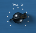
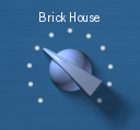
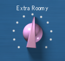
Here is screenshots of large knobs with beak (subtypes from 9 to 15, respectively) how they look:

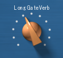


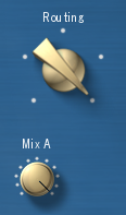
Here A channel knob for routing is changed from default (subtype 0) to orange beak (subtype 5);

Small knobs with beak (subtypes from 2 to 8) looks and behaves exactly like their big brothers, with only exception that they are 50% smaller. Each of the widgets above can be taken into use with resource definitions like;
 # Black (ebony) knob
 knob_program_selector = Program|34|80|9|1|99
 # Blue knob
 knob_program_selector = Program|34|80|10|1|99
 # Indigo knob
 knob_program_selector = Program|34|80|11|1|99
 # Orange knob
 knob_program_selector = Program|34|80|12|1|99
 # Pink knob
 knob_program_selector = Program|34|80|13|1|99
 # White (ivory) knob
 knob_program_selector = Program|34|80|14|1|99
 # Yellow knob
 knob_program_selector = Program|34|80|15|1|99
The last two fields in widget resource definitions are minimum and maximum value of the widget, and they together forms a range of the widget. Normally there is no need to change them, as they are pre-set with right values.
Buttons
Lets have a look the reset button parameters as an example (that's the button located in top of the window). When you open the widget resource file in text editor, you will find a line;
button_reset = Reset|400|4|6|#|#
The first item in line is the widget's resource ID what you should not change, it is used by Leevi internally to find each widget when Leevi is constructing its user interface. After the widget resource ID there is a word, 'Reset', which is the label of the widget. You may change that whatever you wish. Please remember that maximum length of label is 32 characters.
After the label there is delimiter mark '|' which is used to separate each field from each other. You must not change delimiter marks, otherwise Leevi is not able succesfully construct the widget for your window. Next two fields, '400' and '4', are X and Y coordinates of the widget measured from upper left corner of the window, so reset button is located at 400 pixels from the left edge, and 4 pixels from the top.
Next field, which is '6' in our example, is the widget's subtype. Subtype changes widget outlook. Please see table below how button widgets outlook can be changed;
| Subtype | Expected result |
| 0 | Black (ebony) button |
| 1 | Blue button |
| 2 | Indigo button |
| 3 | Orange button |
| 4 | Pink button |
| 5 | White (ivory) button |
| 6 | Yellow button (default) |
| 7 | Two position switch |
Here is screenshots of buttons (subtypes from 0 to 6, respectively) how they look:


Each of the buttons above can be taken into use with resource definitions like;
 # Black button
 button_reset = Reset|400|4|0|#|#
 # Blue button
 button_reset = Reset|400|4|1|#|#
 # Indigo button
 button_reset = Reset|400|4|2|#|#
 # Orange button
 button_reset = Reset|400|4|3|#|#
 # Pink button
 button_reset = Reset|400|4|4|#|#
 # White button
 button_reset = Reset|400|4|5|#|#
 # Yellow button
 button_reset = Reset|400|4|6|#|#
The last two fields in widget resource definitions are minimum and maximum value of the widget. They are not needed in button widgets and must be defined as '#'.
Lamps
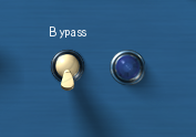
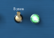
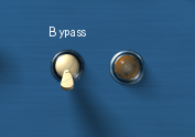
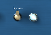
Lets have a look the effect bypass indicator lamp parameters as an example (that's the lamp located right hand side of the bypass switch). When you open the widget resource file in text editor, you will find a line;
lamp_effect_bypass = On|350|96|4|#|#
The first item in line is the widget's resource ID what you should not change, it is used by Leevi internally to find each widget when Leevi is constructing its user interface. After the widget resource ID there is a word, 'On', which is the label of the widget. You may change that whatever you wish. Please remember that maximum length of label is 32 characters. Note that in our example printing the label is internally disabled because the switch to control the lamp already has a label.
After the label there is delimiter mark '|' which is used to separate each field from each other. You must not change delimiter marks, otherwise Leevi is not able succesfully construct the widget for your window. Next two fields, '350' and '96', are X and Y coordinates of the widget measured from upper left corner of the window, so bypass indicator lamp is located at 350 pixels from the left edge, and 96 pixels from the top.
Next field, which is '4' in our example, is the widget's subtype. Subtype changes lamp widget outlook. Please see table below how lamp widget outlook can be changed;
| Subtype | Expected result |
| 0 | Blue lamp |
| 1 | Green lamp |
| 2 | Orange lamp |
| 3 | Purple lamp |
| 4 | Red lamp (default) |
| 5 | Transparent (white) lamp |
| 6 | Yellow lamp |
Lamp widgets are just indicators, meaning that they do not interact with user. Lamp state changes only when some other widget or event triggers lamp either on or off.
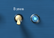
Here is screenshots of lamps how they look. Blue lamp off and on (subtype 0);

Green lamp off and on (subtype 1);

Orange lamp off and on (subtype 2);

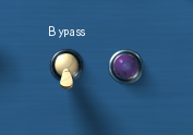
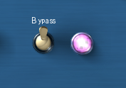
Purple lamp off and on (subtype 3);
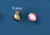
Red lamp off and on (subtype 4);

Transparent (white) lamp off and on (subtype 5);
Yellow lamp off and on (subtype 6);


Each of the lamps above can be taken into use with resource definitions like;
 # Blue lamp
 lamp_effect_bypass = On|350|96|0|#|#
 # Green lamp
 lamp_effect_bypass = On|350|96|1|#|#
 # Orange lamp
 lamp_effect_bypass = On|350|96|2|#|#
 # Purple lamp
 lamp_effect_bypass = On|350|96|3|#|#
 # Red lamp
 lamp_effect_bypass = On|350|96|4|#|#
 # Transparent (white) lamp
 lamp_effect_bypass = On|350|96|5|#|#
 # Yellow lamp
 lamp_effect_bypass = On|350|96|6|#|#
The last two fields in widget resource definitions are minimum and maximum value of the widget. They are not needed in lamp widgets and must be defined as '#'.